

در این مطلب و مطالب بعدی ، چهار نمونه کد زیبا برای Border بصورت انیمیشی در اختیارتون میزارم که میتونین برای زیباتر شدن سایتتون از اونا ایده بگیرین.
کدهای HTML :
|
1
2
3
4
5
6
7
8
9
10
11
12
13
14
15
|
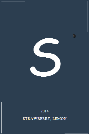
<div class=“demo-1”>
<div class=“grid”>
<div class=“box”>
<svg xmlns=“http://www.w3.org/2000/svg” width=“100%” height=“100%”>
<line class=“top” x1=“0” y1=“0” x2=“900” y2=“0”/>
<line class=“left” x1=“0” y1=“460” x2=“0” y2=“-920”/>
<line class=“bottom” x1=“300” y1=“460” x2=“-600” y2=“460”/>
<line class=“right” x1=“300” y1=“0” x2=“300” y2=“1380”/>
</svg>
<h3>S</h3>
<span>2014</span>
<span>Strawberry, Lemon</span>
</div>
</div>
</div>
|
کدهای CSS :
|
1
2
3
4
5
6
7
8
9
10
11
12
13
14
15
16
17
18
19
20
21
22
23
24
25
26
27
28
29
30
31
32
33
34
35
36
37
38
39
40
41
42
43
44
45
46
47
48
49
50
51
52
53
54
55
56
57
58
59
60
61
62
63
64
65
66
67
68
69
70
71
72
73
74
75
76
77
78
79
80
81
82
83
84
85
86
87
88
89
90
91
92
93
94
95
96
97
98
99
100
101
102
103
104
|
*, *:after, *:before { -webkit-box-sizing: border-box; -moz-box-sizing: border-box; box-sizing: border-box; }
body {
background: #2c3e50;
}
.box {
width: 300px;
height: 460px;
position: relative;
background: rgba(255,255,255,1);
display: inline-block;
margin: 50px 50px;
text-align: center;
cursor: pointer;
color: #2c3e50;
box-shadow: inset 0 0 0 3px #2c3e50;
-webkit-transition: background 0.4s 0.5s;
transition: background 0.4s 0.5s;
}
.box:hover {
background: rgba(255,255,255,0);
-webkit-transition-delay: 0s;
transition-delay: 0s;
}
.box h3 {
font-family: “Ruthie”, cursive;
font-size: 180px;
line-height: 370px;
margin: 0;
font-weight: 400;
width: 100%;
}
.box span {
display: block;
font-weight: 400;
text-transform: uppercase;
letter-spacing: 1px;
font-size: 13px;
padding: 5px;
}
.box h3,
.box span {
-webkit-transition: color 0.4s 0.5s;
transition: color 0.4s 0.5s;
}
.box:hover h3,
.box:hover span {
color: #fff;
-webkit-transition-delay: 0s;
transition-delay: 0s;
}
.box svg {
position: absolute;
top: 0;
left: 0;
}
.box svg line {
stroke-width: 3;
stroke: #ecf0f1;
fill: none;
-webkit-transition: all .8s ease-in-out;
transition: all .8s ease-in-out;
}
.box:hover svg line {
-webkit-transition-delay: 0.1s;
transition-delay: 0.1s;
}
.box svg line.top,
.box svg line.bottom {
stroke-dasharray: 330 240;
}
.box svg line.left,
.box svg line.right {
stroke-dasharray: 490 400;
}
.box:hover svg line.top {
-webkit-transform: translateX(-600px);
transform: translateX(-600px);
}
.box:hover svg line.bottom {
-webkit-transform: translateX(600px);
transform: translateX(600px);
}
.box:hover svg line.left {
-webkit-transform: translateY(920px);
transform: translateY(920px);
}
.box:hover svg line.right {
-webkit-transform: translateY(-920px);
transform: translateY(-920px);
}
|
میبینید که زمانی که روی Box مورد نظر هاور میکنید ، Border اون بصورت انیمیشنی تغییر میکنه.
امیدوارم خوشتون اومده باشه.
موفق باشید. یا علی


